![]() Line Graph
Line Graph
| Top | Previous | Next |
|
|
|
The Line Graph Populating data including the concepts of data keys, sorting, and filtering are nearly identical to that of a table.
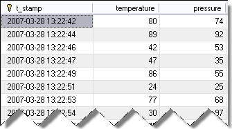
The Line Graph component is used to display data where the X value is time or numeric, and the Y value(s) are numeric. Lets set up a graph for some timeseries data. Suppose you have a table with data like this:
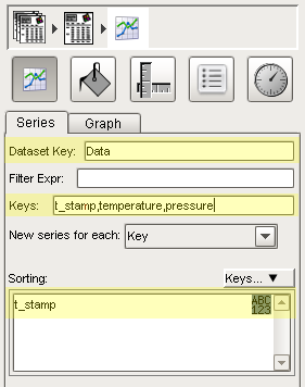
The t_stamp column is your X value, and the other columns are your "pens" or series of Y values. You get this data into a report by binding a DataSet property of the report viewer (see Concepts > Basic > Dynamic Properties) to a SQL query, such as SELECT t_stamp, temperature, pressure FROM graph_data. Lets say that you had this data in the default Data property. You set up the Line Graph's data the same way you would a Graph or Table. The only trick is that the keys needs to be a comma separated list of keys, with the first one being your X value. Lastly, make sure that the data is sorted ascending by the X value. The following setup:
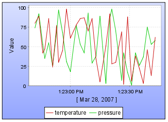
... will produce a line chart like this:
Basic graph settings can be found on the Graph Tab of the line graph shape specific inspector.
Embedding Graphs in a table row Graphs can be embedded in table rows. Leave the Dataset Key blank to have access to the data provided at that level of grouping! This technique is demonstrated in Tutorial #2. Since a graph is generally a large shape, you usually want to define an explicit page break for the row that contains the graph, so that the graph won't get chopped off on a page boundary. Select the light gray region to the left of the Group in the Table inspector to do this. |