|
Next, add Graphs to the report!
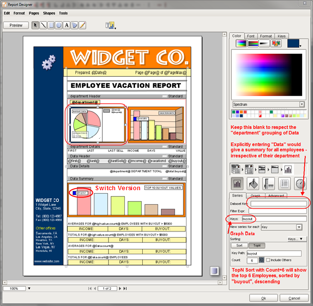
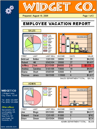
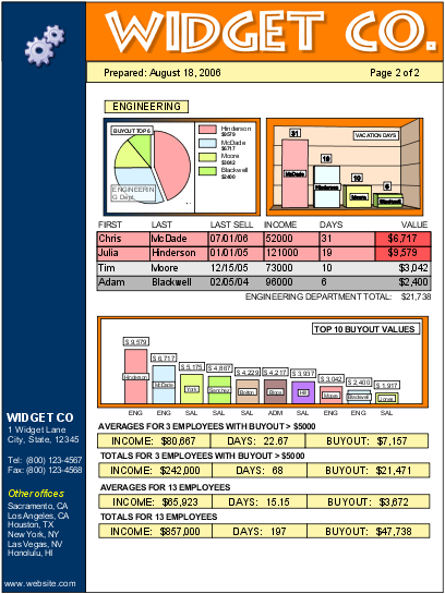
| 1. | Drag 2 graphs down to the department Header. The left one will be a buyout pie graph, while the right will be a vacation days bar graph. |
| 2. | For both graphs, ensure the Dataset Key is blank. Found under graph->shapespecific inspector->Series tab. Set Keys: to buyout and vacationdays, respectively. |
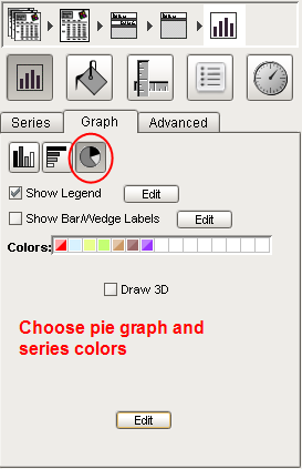
| 3. | Make one graph a pie graph and the other a bar graph. Look for icons under graph->shapespecific inspector->Graph tab Notice that you can set series colors here under Colors. |
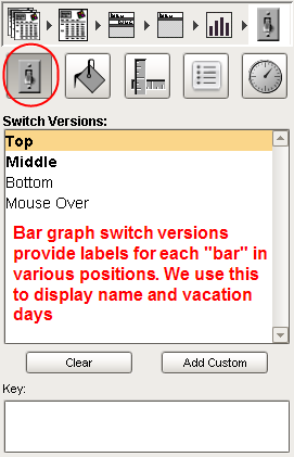
| 4. | Enable switch versions by checking Show Bar/Wedge Labels. We will add one on the top and one in the middle. Look at bar chart labels on the final screenshot for an example. |
| 5. | Use lots of double clicking to drilling down to select basic shapes and text. Change colors and fonts as desired. |
| 6. | Added semi transparent label with department subtotal (@total.buyout@) to the pie graph. |
| 7. | Added department label for summary bar graph using bottom switch version. @substring(department,0,3)@ used string functions to display a 3 letter abbreviation. |
Index Previous (More Changes) On to Tutorial 3
TIP
|
The toughest part of creating small graphs is labeling the data legibly. This takes a little practice. Don't hesitate to mess up your report playing with options, then click cancel in the customizer window and start over again. You'll get the hang of it in no time!
|
|