|
This guide steps you through creating basic report that contains a table and pie chart with the default DataSet, Data, shown below. Click here to learn how to install the Ignition Reporting module or here to learn how to populate the report with your own data.
Instructions
We begin with the default DataSet, Data, that comes attached to every Report Viewer.
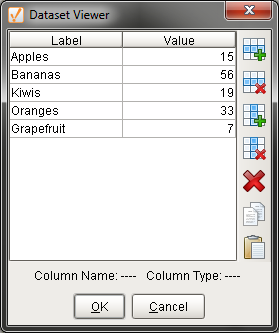
Default DataSet, Data
Here are the steps to creating the report:
| 1. | Install Ignition Reporting Module |
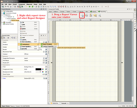
| 2. | Drag Report Viewer from Reporting tab into project window |
| 3. | Open Report Designer by selecting Report Viewer and clicking on the Customizer. |
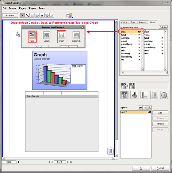
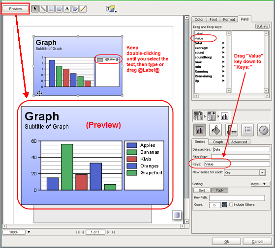
| 6. | Click on the report to unselect the graph. Drag Data again, this time select table. |
| 7. | Drag Value key down to "Keys:" or type Value |
| 8. | Keep double-clicking until you select "Legend" then type @Label@ or drag the Label key in. |
| 11. | Superselect the graph shape and resize the graph and legend. |
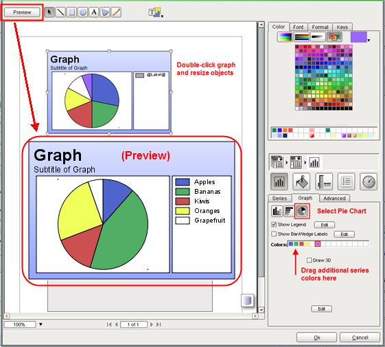
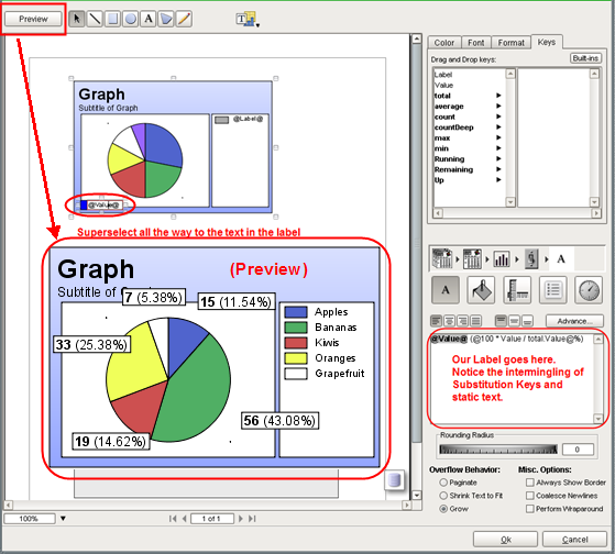
| 12. | On the Graph tab, check Show Bar/Wedge Labels. |
| 13. | Superselect the label text. Change the font size to 12 point. |
| 14. | Change the text to "@Value@ (@100 * Value / total.Value@%)". We're intermingling static text and substitution keys to display both the value and percentage. |
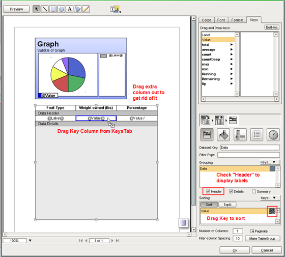
| 15. | Select @Value@ text and type Cntl+B to make it bold. |
| 16. | Select Table and check Header |
| 17. | Drag extra column off workspace to get rid of it. This can also be done in the table inspector. |
| 18. | Type in headers. In this case we made the text bold and centered. |
| 19. | Drag key columns to Data Details columns. |
| 20. | For percentage, we use "@Value / Up.total.Value * 100@%" or "@Value / Data.total.Value * 100@%" |
| 21. | Drag Value key to Sorting:. Click descending sort  . . |
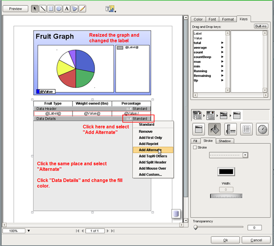
| 22. | Resize the graph and modify the label |
| 24. | Click Standard on Data Details, select Alternate |
| 26. | Do the same for the Data Header fill color with a darker gray. |
| 27. | Select the graph and add a border (stroke) in the Stroke tab. |
| 28. | Drag in a gradient filled rectangle, text and the included image Bultin/icons/48/check2.png to create our header |
| 29. | From the Keys tab, click Built-ins and drag down page numbers. |
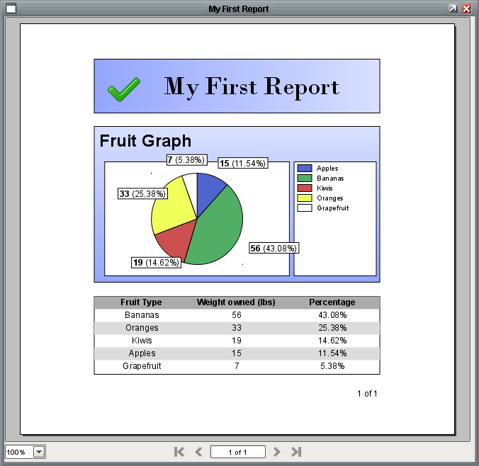
Our finished first report
|