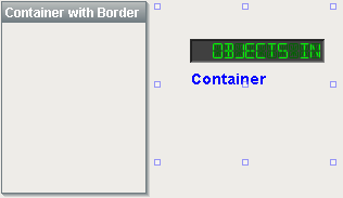
Description
The container is a very important component. All components are always inside of a container, except for the special "Root Container" of each window (see Anatomy of a Window). A container is different than normal components in that it can contain other components, including other containers. Uses for containers include:
| • | Organization. Containers can be used to group components together. These components can then easily be moved, copied, or deleted as a group. Furthermore, they will all be organized inside of their parent container in the project navigation tree, which makes them easier to find. |
| • | Re-usability. Containers allow a unique opportunity to create a complex component that is made up of multiple other components. The Container's ability to have dynamic properties aids this greatly. For instance, if you wanted to make your own custom HOA control, you can put three buttons inside of a container and configure them to all use a 'status' property that you add to their parent Container. Now you have built an HOA control that can be re-used and treated like its own component. The possibilities here are endless. Create a date range control that generates an SQL WHERE clause that can be used to control Charts and Tables. Create a label/button control that can be used to display datapoints, and pop up a parameterized window that displays meta-data (engineering units, physical location, notes, etc) about that datapoint. Creating re-usable controls with Containers containing multiple components is the key to rapid application development. |
| • | Layout. Containers are a great way to improve window aesthetics through borders and layout options. |
Grouping
A container can be set as a "group" by right-clicking on it and choosing "Group Container". This will make the container act like a single component - you won't be able to select its children by clicking on them. This can help make window design easier, as you'll always pick the container by clicking anywhere inside it. You can still get to the individual sub-components by choosing them in the project navigation tree. You can un-group a container at any time by right clicking on it and choosing "Ungroup Container".
See also:
Properties
Appearance |
|||||||||||||||||||||||||||||||||||
Font |
Font of text of this component
|
||||||||||||||||||||||||||||||||||
Background Color |
Set the color of the background
|
||||||||||||||||||||||||||||||||||
Texture |
Background texture image for this container.
|
||||||||||||||||||||||||||||||||||
Styles |
Contains the component's styles
|
||||||||||||||||||||||||||||||||||
Behavior |
|||||||||||||||||||||||||||||||||||
Combine Repaints |
Set this to true for containers with many sub-components that need to redraw frequently (flashing, rotating, animating).
|
||||||||||||||||||||||||||||||||||
Tile Optimized |
If true, this container's children should never overlap, and you'll get better painting performance.
|
||||||||||||||||||||||||||||||||||
Common |
|||||||||||||||||||||||||||||||||||
Name |
The name of this component.
|
||||||||||||||||||||||||||||||||||
Visible |
If disabled, the component will be hidden.
|
||||||||||||||||||||||||||||||||||
Border |
The border surrounding this component. NOTE that the border is unaffected by rotation.
|
||||||||||||||||||||||||||||||||||
Mouseover Text |
The text that is displayed in the tooltip which pops up on mouseover of this component.
|
||||||||||||||||||||||||||||||||||
Opaque |
If false, backgrounds are not drawn. If true, backgrounds are drawn.
|
||||||||||||||||||||||||||||||||||
Cursor |
The mouse cursor to use when hovering over this component.
|
||||||||||||||||||||||||||||||||||
Data |
|||||||||||||||||||||||||||||||||||
Data Quality |
The data quality code for any tag bindings on this component.
|
||||||||||||||||||||||||||||||||||
Scripting
Events
The following event sets are fired by this component. See Component Event Handlers to learn more.
| • | mouse |
| • | mouseMotion |
| • | propertyChange |
Scripting Functions
This component has no special scripting functions.