 3 Multi-State Buttons |
 Many configurations |
Description
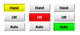
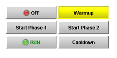
This button is really a series of two or more buttons, arranged in a column, row, or grid. Each button represents an integer-valued state. Each state defines two styles for a button: the selected style, and the unselected style. Each button is automatically displayed with the correct style based on the current state (the value of Indicator Value). When a button is pressed, its state's value is written to the Control Value.
To configure a Multi-State Button, simply drag a tag that represents your state onto the Multi-State Button. This will bind both the Control Value and Indicator Value to that tag. Now open up the Multi-State Button customizer, and define your states: their order, values and styles. Lastly choose if you want the buttons to be a column, row, or grid by setting the Display Style property.
See also:
Properties
Appearance |
|||||||||||||||||||||||||||||||||||
Font |
Font of text of this component
|
||||||||||||||||||||||||||||||||||
Display Style |
The display style (rows or columns) for this N-state button.
|
||||||||||||||||||||||||||||||||||
Horizontal Gap |
The horizontal spacing between buttons
|
||||||||||||||||||||||||||||||||||
Vertical Gap |
The vertical spacing between buttons
|
||||||||||||||||||||||||||||||||||
Grid Rows |
The number of rows if the Display Style is set to "Grid" mode.
|
||||||||||||||||||||||||||||||||||
Grid Cols |
The number of columns if the Display Style is set to "Grid" mode.
|
||||||||||||||||||||||||||||||||||
Antialias |
Draw with antialias on? Makes text smoother
|
||||||||||||||||||||||||||||||||||
Background 3D? |
Controls whether or not the buttons have a gradient-style background color.
|
||||||||||||||||||||||||||||||||||
Behavior |
|||||||||||||||||||||||||||||||||||
Confirm? |
If true, a confirmation box will be shown.
|
||||||||||||||||||||||||||||||||||
Confirm Text |
The message to ask the user if confirmation is turned on.
|
||||||||||||||||||||||||||||||||||
States |
A Dataset that stores the information for the different states.
|
||||||||||||||||||||||||||||||||||
Rollover |
If true, the button may indicate that the mouse is hovering over it.
|
||||||||||||||||||||||||||||||||||
Focusable |
If a button is not focusable, you will not be able to interact with it with the keyboard. This means you can't "tab" over to it.
|
||||||||||||||||||||||||||||||||||
Common |
|||||||||||||||||||||||||||||||||||
Name |
The name of this component.
|
||||||||||||||||||||||||||||||||||
Enabled |
If disabled, a component cannot be used.
|
||||||||||||||||||||||||||||||||||
Visible |
If disabled, the component will be hidden.
|
||||||||||||||||||||||||||||||||||
Mouseover Text |
The text that is displayed in the tooltip which pops up on mouseover of this component.
|
||||||||||||||||||||||||||||||||||
Cursor |
The mouse cursor to use when hovering over this component.
|
||||||||||||||||||||||||||||||||||
Data |
|||||||||||||||||||||||||||||||||||
Control Value |
Bind this to the tag that controls the state. (Typically, this is bound to the same location as Indicator Value)
|
||||||||||||||||||||||||||||||||||
Indicator Value |
Bind this to the tag that indicates the current state. (Typically, this is bound to the same location as Control Value)
|
||||||||||||||||||||||||||||||||||
Data Quality |
The data quality code for any tag bindings on this component.
|
||||||||||||||||||||||||||||||||||
Scripting
Events
The following event sets are fired by this component. See Component Event Handlers to learn more.
| • | mouse |
| • | mouseMotion |
| • | propertyChange |
| • | key |
Scripting Functions
This component has no special scripting functions.