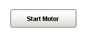
 A One-Shot button, |
 A One-Shot button, |
Description
The latched button is great for telling a PLC to do something. It simply writes a value, and then waits for it to be reset by the PLC before it is available again. Note that this is only applicable when the PLC is programmed to reset the value after reading it. If your PLC expects the HMI to reset the bit, use the Momentary Button. Also note that this component is considered safer than the momentary button, because it receives positive feedback from the PLC that the signal was received, avoiding the timing dangers associated with a Momentary Button.
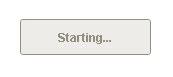
To use the latched button, bind an OPC tag bidirectionally to the latched button's Value property. When clicked, the button will write the value in its Set Value property to the Value property. Typically, Set Value is 1, and Value is 0 in a ready state, although the logic could be reversed or change simply by altering Set Value. The button can disable itself when it is writing, and will display different text. Note that the button considers itself to be writing whenever Value equals Set Value - you must make sure that the PLC resets this value, otherwise the button will remain in a writing state.
See also:
Properties
Appearance |
|||||||||||||||||||||||||||||||||||
Font |
Font of text of this component
|
||||||||||||||||||||||||||||||||||
Foreground Color |
The foreground color of the component.
|
||||||||||||||||||||||||||||||||||
Background Color |
The background color of the button.
|
||||||||||||||||||||||||||||||||||
Background 3D? |
Should this button have a 3d type background, or a flat color one?
|
||||||||||||||||||||||||||||||||||
Fill Area? |
Controls whether or not this button's internal area is filled
|
||||||||||||||||||||||||||||||||||
Border Painted? |
Should the border of this button be displayed?
|
||||||||||||||||||||||||||||||||||
Image Path |
The relative path of the image.
|
||||||||||||||||||||||||||||||||||
Disabled Image Path |
The relative path of the image to be displayed when this component is not enabled.
|
||||||||||||||||||||||||||||||||||
Icon-Text Spacing |
The space (in pixels) between the icon (if any) and the text (if any)
|
||||||||||||||||||||||||||||||||||
Antialias |
Draw with antialias on? Makes text smoother
|
||||||||||||||||||||||||||||||||||
Styles |
Contains the component's styles
|
||||||||||||||||||||||||||||||||||
Behavior |
|||||||||||||||||||||||||||||||||||
Rollover |
If true, the button may indicate that the mouse is hovering over it.
|
||||||||||||||||||||||||||||||||||
Focusable |
If a button is not focusable, you will not be able to interact with it with the keyboard. This means you can't "tab" over to it.
|
||||||||||||||||||||||||||||||||||
Idle Text |
The text of the button while its value is not being written
|
||||||||||||||||||||||||||||||||||
Writing Text |
The text of the button while its value is being written
|
||||||||||||||||||||||||||||||||||
Disable While Writing |
If true, the button will be disabled while it is writing.
|
||||||||||||||||||||||||||||||||||
Confirm? |
If true, a confirmation box will be shown.
|
||||||||||||||||||||||||||||||||||
Confirm Text |
The message to ask the user if confirmation is turned on.
|
||||||||||||||||||||||||||||||||||
Mnemonic |
A single letter that will activate the button using 'ALT-mnemonic'.
|
||||||||||||||||||||||||||||||||||
Common |
|||||||||||||||||||||||||||||||||||
Name |
The name of this component.
|
||||||||||||||||||||||||||||||||||
Enabled |
If disabled, a component cannot be used.
|
||||||||||||||||||||||||||||||||||
Visible |
If disabled, the component will be hidden.
|
||||||||||||||||||||||||||||||||||
Mouseover Text |
The text that is displayed in the tooltip which pops up on mouseover of this component.
|
||||||||||||||||||||||||||||||||||
Cursor |
The mouse cursor to use when hovering over this component.
|
||||||||||||||||||||||||||||||||||
Border |
The border surrounding this component. NOTE that the border is unaffected by rotation.
|
||||||||||||||||||||||||||||||||||
Opaque |
Is this button completely opaque? Most aren't, so this should usually be false.
|
||||||||||||||||||||||||||||||||||
Data |
|||||||||||||||||||||||||||||||||||
Data Quality |
The data quality code for any tag bindings on this component.
|
||||||||||||||||||||||||||||||||||
Value |
The current value. Should be bound bi-directionally to a tag
|
||||||||||||||||||||||||||||||||||
Set Value |
The value to set the control value to when the button is pushed.
|
||||||||||||||||||||||||||||||||||
Layout |
|||||||||||||||||||||||||||||||||||
Margin |
The space between a button's text and its borders.
|
||||||||||||||||||||||||||||||||||
Horizontal Alignment |
The horizontal alignment of the button's contents (text and/or image)
|
||||||||||||||||||||||||||||||||||
Horizontal Text Position |
The horizontal position of the button's text relative to its image
|
||||||||||||||||||||||||||||||||||
Vertical Alignment |
The vertical alignment of the button's contents (text and/or image)
|
||||||||||||||||||||||||||||||||||
Vertical Text Position |
The vertical position of the button's text relative to its image
|
||||||||||||||||||||||||||||||||||
Scripting
Events
The following event sets are fired by this component. See Component Event Handlers to learn more.
| • | mouse |
| • | mouseMotion |
| • | focus |
| • | action |
| • | propertyChange |
| • | key |
Scripting Functions
This component has no special scripting functions.