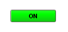
 The default "on" style |
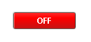 The default "off" style |
 Styles are highly |
Description
This button is similar to the basic Toggle Button, but more finely tuned to work in realistic controls environments. Use this button any time you want to toggle a value between two states, such as On/Off, Stop/Run, etc. If you have more than two states (for example, Hand/Off/Auto, use the Multi-State Button).
If you have a tag whose value you want to toggle between 2 values (like zero and one), you can simply drag and drop the tag onto the button. This will bind both the Control Value and Indicator Value properties to that tag. Now set the State 1 Value and State 2 Value to your two states (they default to zero and one, respectively). Lastly, use the Styles Customizer to define the styles for your two states.
This button has four integer values that you use to set it up: the Control Value, the Indicator Value, and values that define the 2 different states: State 1 Value and State 2 Value. Every time you press the button, one of the state values is written to the control value. The Indicator Value is used to determine which state you're in. For example, suppose that State 1 Value was zero and State 2 Value is one. If Indicator Value is zero and you press the button, it'll write a one to the Control Value. The Style of the component is typically driven by the read-only property Current State. Current State equals zero when Indicator Value=State 1 Value and one otherwise.
See also:
Properties
Appearance |
|||||||||||||||||||||||||||||||||||
Font |
Font of text of this component
|
||||||||||||||||||||||||||||||||||
Foreground Color |
The foreground color of the component.
|
||||||||||||||||||||||||||||||||||
Background Color |
The background color of the button.
|
||||||||||||||||||||||||||||||||||
Background 3D? |
Should this button have a 3d type background, or a flat color one?
|
||||||||||||||||||||||||||||||||||
Fill Area? |
Controls whether or not this button's internal area is filled
|
||||||||||||||||||||||||||||||||||
Border Painted? |
Should the border of this button be displayed?
|
||||||||||||||||||||||||||||||||||
Text |
Text of this component
|
||||||||||||||||||||||||||||||||||
Image Path |
The relative path of the image.
|
||||||||||||||||||||||||||||||||||
Disabled Image Path |
The relative path of the image to be displayed when this component is not enabled.
|
||||||||||||||||||||||||||||||||||
Icon-Text Spacing |
The space (in pixels) between the icon (if any) and the text (if any)
|
||||||||||||||||||||||||||||||||||
Antialias |
Draw with antialias on? Makes text smoother
|
||||||||||||||||||||||||||||||||||
Styles |
Contains the component's styles
|
||||||||||||||||||||||||||||||||||
Behavior |
|||||||||||||||||||||||||||||||||||
Rollover |
If true, the button may indicate that the mouse is hovering over it.
|
||||||||||||||||||||||||||||||||||
Focusable |
If a button is not focusable, you will not be able to interact with it with the keyboard. This means you can't "tab" over to it.
|
||||||||||||||||||||||||||||||||||
Confirm? |
If true, a confirmation box will be shown.
|
||||||||||||||||||||||||||||||||||
Confirm Text |
The message to ask the user if confirmation is turned on.
|
||||||||||||||||||||||||||||||||||
Mnemonic |
A single letter that will activate the button using 'ALT-mnemonic'.
|
||||||||||||||||||||||||||||||||||
Common |
|||||||||||||||||||||||||||||||||||
Name |
The name of this component.
|
||||||||||||||||||||||||||||||||||
Enabled |
If disabled, a component cannot be used.
|
||||||||||||||||||||||||||||||||||
Visible |
If disabled, the component will be hidden.
|
||||||||||||||||||||||||||||||||||
Mouseover Text |
The text that is displayed in the tooltip which pops up on mouseover of this component.
|
||||||||||||||||||||||||||||||||||
Cursor |
The mouse cursor to use when hovering over this component.
|
||||||||||||||||||||||||||||||||||
Border |
The border surrounding this component. NOTE that the border is unaffected by rotation.
|
||||||||||||||||||||||||||||||||||
Opaque |
Is this button completely opaque? Most aren't, so this should usually be false.
|
||||||||||||||||||||||||||||||||||
Data |
|||||||||||||||||||||||||||||||||||
Data Quality |
The data quality code for any tag bindings on this component.
|
||||||||||||||||||||||||||||||||||
Control Value |
Bind this to the tag that controls the state. (Typically, this is bound to the same location as Indicator Value)
|
||||||||||||||||||||||||||||||||||
Indicator Value |
Bind this to the tag that indicates the current state. (Typically, this is bound to the same location as Control Value)
|
||||||||||||||||||||||||||||||||||
State 1 Value |
The value that will be written to controlValue when the button is pushed in state 2.
|
||||||||||||||||||||||||||||||||||
State 2 Value |
The value that will be written to controlValue when the button is pushed in state 1.
|
||||||||||||||||||||||||||||||||||
Current State |
Read-only property that shows what state (0 or 1) this button is currently in.
|
||||||||||||||||||||||||||||||||||
Layout |
|||||||||||||||||||||||||||||||||||
Margin |
The space between a button's text and its borders.
|
||||||||||||||||||||||||||||||||||
Horizontal Alignment |
The horizontal alignment of the button's contents (text and/or image)
|
||||||||||||||||||||||||||||||||||
Horizontal Text Position |
The horizontal position of the button's text relative to its image
|
||||||||||||||||||||||||||||||||||
Vertical Alignment |
The vertical alignment of the button's contents (text and/or image)
|
||||||||||||||||||||||||||||||||||
Vertical Text Position |
The vertical position of the button's text relative to its image
|
||||||||||||||||||||||||||||||||||
Scripting
Events
The following event sets are fired by this component. See Component Event Handlers to learn more.
| • | mouse |
| • | mouseMotion |
| • | focus |
| • | action |
| • | propertyChange |
| • | key |
Scripting Functions
This component has no special scripting functions.