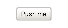
 A standard |
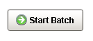 Buttons can |
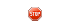 Buttons can |
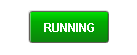 Buttons can |
Description
The Button component is a versatile component, often used for things like opening/closing windows, writing to tags, and triggering any sort of scripting logic. It can be used for showing status, as well. For example, if you have three buttons, Hand, Off, and Auto, not only can they set those modes, but their background color can display the current mode, although you'd be better off using the Multi-State Button for this.
To get buttons to do things, you add an event handler to the actionPerformed event. Many new users to the 1.0.0 module will configure an event handler for the mouseClicked event instead. While this will work, it is better to use the actionPerformed event. Why? Buttons can also be activated by tabbing over to them and hitting the space key, or they could be activated by pressing Alt and the button's mnemonic character. So, to make sure that your button works in all of these cases, configure your event handler on the actionPerformed event, not the mouseClicked event.
See also:
Properties
Appearance |
|||||||||||||||||||||||||||||||||||
Font |
Font of text of this component
|
||||||||||||||||||||||||||||||||||
Foreground Color |
The foreground color of the component.
|
||||||||||||||||||||||||||||||||||
Background Color |
The background color of the button.
|
||||||||||||||||||||||||||||||||||
Background 3D? |
Should this button have a 3d type background, or a flat color one?
|
||||||||||||||||||||||||||||||||||
Fill Area? |
Controls whether or not this button's internal area is filled
|
||||||||||||||||||||||||||||||||||
Border Painted? |
Should the border of this button be displayed?
|
||||||||||||||||||||||||||||||||||
Text |
Text of this component
|
||||||||||||||||||||||||||||||||||
Image Path |
The relative path of the image.
|
||||||||||||||||||||||||||||||||||
Disabled Image Path |
The relative path of the image to be displayed when this component is not enabled.
|
||||||||||||||||||||||||||||||||||
Icon-Text Spacing |
The space (in pixels) between the icon (if any) and the text (if any)
|
||||||||||||||||||||||||||||||||||
Antialias |
Draw with antialias on? Makes text smoother
|
||||||||||||||||||||||||||||||||||
Styles |
Contains the component's styles
|
||||||||||||||||||||||||||||||||||
Behavior |
|||||||||||||||||||||||||||||||||||
Rollover |
If true, the button may indicate that the mouse is hovering over it.
|
||||||||||||||||||||||||||||||||||
Focusable |
If a button is not focusable, you will not be able to interact with it with the keyboard. This means you can't "tab" over to it.
|
||||||||||||||||||||||||||||||||||
Mnemonic |
A single letter that will activate the button using 'ALT-mnemonic'.
|
||||||||||||||||||||||||||||||||||
Default Button |
If true, this button will be activated when the user presses enter on the window.
|
||||||||||||||||||||||||||||||||||
Common |
|||||||||||||||||||||||||||||||||||
Name |
The name of this component.
|
||||||||||||||||||||||||||||||||||
Enabled |
If disabled, a component cannot be used.
|
||||||||||||||||||||||||||||||||||
Visible |
If disabled, the component will be hidden.
|
||||||||||||||||||||||||||||||||||
Mouseover Text |
The text that is displayed in the tooltip which pops up on mouseover of this component.
|
||||||||||||||||||||||||||||||||||
Cursor |
The mouse cursor to use when hovering over this component.
|
||||||||||||||||||||||||||||||||||
Border |
The border surrounding this component. NOTE that the border is unaffected by rotation.
|
||||||||||||||||||||||||||||||||||
Opaque |
Is this button completely opaque? Most aren't, so this should usually be false.
|
||||||||||||||||||||||||||||||||||
Data |
|||||||||||||||||||||||||||||||||||
Data Quality |
The data quality code for any tag bindings on this component.
|
||||||||||||||||||||||||||||||||||
Layout |
|||||||||||||||||||||||||||||||||||
Margin |
The space between a button's text and its borders.
|
||||||||||||||||||||||||||||||||||
Horizontal Alignment |
The horizontal alignment of the button's contents (text and/or image)
|
||||||||||||||||||||||||||||||||||
Horizontal Text Position |
The horizontal position of the button's text relative to its image
|
||||||||||||||||||||||||||||||||||
Vertical Alignment |
The vertical alignment of the button's contents (text and/or image)
|
||||||||||||||||||||||||||||||||||
Vertical Text Position |
The vertical position of the button's text relative to its image
|
||||||||||||||||||||||||||||||||||
Scripting
Events
The following event sets are fired by this component. See Component Event Handlers to learn more.
| • | mouse |
| • | mouseMotion |
| • | focus |
| • | action |
| • | propertyChange |
| • | key |
Scripting Functions
|
||||||||