Trees are useful for navigating
hierarchies.
Description
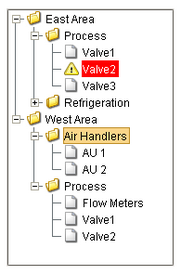
The Tree View component can display any tree hierarchy. It is configured by filling in a dataset. Each row in the dataset will become a node in the tree. Each node has a path, for example, "West Area/Process/Valve1" that determines its location in the tree. The Separation Character property (by default it is forward-slash), dictates how the paths are broken up. Any missing folder nodes needed by a leaf node are created implicitly.
The other columns in the dataset besides "Path" are used to configure the look for the node, both when it is selected and when it is not. Columns with the following names (case-insensitive) in the dataset will be recognized:
| • | Path - the path determines the node's location. Broken up into a list by splitting on the separation character. |
| • | Text - the text of the node while not selected. |
| • | Icon - a path to an icon for the node. Use the value: "default" to use the tree automatic folder/leaf icons. |
| • | Background - a string column that will be coerced into a color for the unselected background. e.g. "white" or "(255,255,255)" Use an empty string to use the default color. |
| • | Foreground - a string representation of the unselected foreground color |
| • | Tooltip - if not empty, will be used as the tooltip for the node. |
| • | Border - a string that will be coerced into a Border for the node while unselected. May be empty. |
| • | SelectedText - the text of the node while selected. |
| • | SelectedIcon - a path to an icon for the node while selected. Use the value: "default" to use the tree automatic folder/leaf icons. |
| • | SelectedBackground - a string representation of the selected foreground color |
| • | SelectedForeground - a string representation of the selected foreground color |
| • | SelectedTooltip - if not empty, will be used as the tooltip for the node while selected. |
| • | SelectedBorder - a string that will be coerced into a Border for the node while selected. May be empty. |
The Selected Item property will be updated as the user selects different nodes in the tree. It represents the index in the Items dataset at which the node is defined. If the selected node was implicitly created, the Selected Item will be -1. You can use this index to get the path and name of the selected node with an expression binding like this:
if ({Root Container.Tree View.selectedItem}<0,"n/a",
{Root Container.Tree View.data}[{Root Container.Tree View.selectedItem},"text"])
Properties
Appearance |
|||||||||||||
Font |
Font of text of this component
|
||||||||||||
Background Color |
The background color of the component.
|
||||||||||||
Row Height |
The height of each row in the tree
|
||||||||||||
Show Root Handles |
Whether or not to show handles next to parent nodes
|
||||||||||||
Default Node Background |
The default background of a node if no background is set
|
||||||||||||
Default Node Foreground |
The default foreground of a node if no foreground is set
|
||||||||||||
Default Node Border |
The default border of a node if no border is set
|
||||||||||||
Default Node Selected Background |
The default selected background of a node if no background is set
|
||||||||||||
Default Node Selected Foreground |
The default selected foreground of a node if no foreground is set
|
||||||||||||
Default Node Selected Border |
The default selected border of a node if no border is set
|
||||||||||||
Default Leaf Icon |
The default leaf icon if no icon is set
|
||||||||||||
Default Open Icon |
The default open icon if no icon is set
|
||||||||||||
Default Closed Icon |
The default closed icon if no icon is set
|
||||||||||||
Line Style |
The tree's line style
|
||||||||||||
Antialias |
Draw with antialias on? Makes text smoother
|
||||||||||||
Behavior |
|||||||||||||
Separation Character |
The separation character for the path
|
||||||||||||
Auto Sort |
Whether or not to automatically sort the tree
|
||||||||||||
Auto Expand |
If true, the tree will automatically expand the tree structure up to the level specified by Auto Expansion Level.
|
||||||||||||
Auto Expansion Level |
If Auto Expand is true, this is the depth level that will be expanded. Zero means expand-all.
|
||||||||||||
Selection Mode |
What kind of selection regions does the tree allow.
|
||||||||||||
Common |
|||||||||||||
Name |
The name of this component.
|
||||||||||||
Enabled |
If disabled, a component cannot be used.
|
||||||||||||
Visible |
If disabled, the component will be hidden.
|
||||||||||||
Border |
The border surrounding this component. NOTE that the border is unaffected by rotation.
|
||||||||||||
Mouseover Text |
The text that is displayed in the tooltip which pops up on mouseover of this component.
|
||||||||||||
Data |
|||||||||||||
Items |
Contains the items of the tree view
|
||||||||||||
Selected Item |
The index of the currently selected item, or -1 if no selection.
|
||||||||||||
Selected Path |
The path of the currently selected item, or "" if no selection.
|
||||||||||||
Data Quality |
The data quality code for any tag bindings on this component.
|
||||||||||||
Scripting
Events
The following event sets are fired by this component. See Component Event Handlers to learn more.
| • | mouse |
| • | mouseMotion |
| • | propertyChange |
Scripting Functions
|
||||||||
|
||||||||
|
||||||||
|
||||||||
|
||||||||