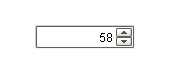
 A Spinner in |
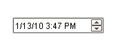 A Spinner in |
Description
The spinner component represents a value that is part of a series of values, such as numbers and dates. It allows you to not only edit the value directly, but to 'spin' the value up or down, using the up and down buttons that are part of the component. When setting up property bindings, make sure you use the value property that corresponds to the spinner mode. For example, if you chose the Double spinner mode, you should bind the doubleValue property.
Properties
Appearance |
|||||||||||||||
Font |
Font of text of this component
|
||||||||||||||
Foreground Color |
The foreground color of the component.
|
||||||||||||||
Background Color |
The background color of the component.
|
||||||||||||||
Number Format |
A number format pattern to use when the spinner is in numeric mode.
|
||||||||||||||
Date Format |
A date format pattern to use when the spinner is in date mode.
|
||||||||||||||
Antialias |
Draw with antialias on? Makes text smoother
|
||||||||||||||
Styles |
Contains the component's styles
|
||||||||||||||
Behavior |
|||||||||||||||
Spinner Mode |
The mode controls which data type this spinner accepts
|
||||||||||||||
Numeric Step Size |
The size to step up or down when in 'Integer' or 'Double' mode.
|
||||||||||||||
Touchscreen Mode |
Controls when this input component responds if touchscreen mode is enabled.
|
||||||||||||||
Common |
|||||||||||||||
Name |
The name of this component.
|
||||||||||||||
Enabled |
If disabled, a component cannot be used.
|
||||||||||||||
Visible |
If disabled, the component will be hidden.
|
||||||||||||||
Border |
The border surrounding this component. NOTE that the border is unaffected by rotation.
|
||||||||||||||
Mouseover Text |
The text that is displayed in the tooltip which pops up on mouseover of this component.
|
||||||||||||||
Data |
|||||||||||||||
Numeric Minimum |
The minimum value this spinner will accept when in 'Integer' or 'Double' mode.
|
||||||||||||||
Numeric Maximum |
The maximum value this spinner will accept when in 'Integer' or 'Double' mode.
|
||||||||||||||
Value (Integer) |
The current value if mode is 'Integer'
|
||||||||||||||
Value (Double) |
The current value if mode is 'Double'
|
||||||||||||||
Value (Date) |
The current value if mode is 'Date'
|
||||||||||||||
Data Quality |
The data quality code for any tag bindings on this component.
|
||||||||||||||
Uncategorized |
|||||||||||||||
Date in Milliseconds |
|
||||||||||||||
Scripting
Events
The following event sets are fired by this component. See Component Event Handlers to learn more.
| • | propertyChange |
Scripting Functions
This component has no special scripting functions.