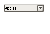
 A Dropdown showing |
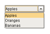 A Dropdown showing |
Description
The dropdown component is a great way to display a list of choices in a limited amount of space. The current selection is shown, and the choices are only presented when the user clicks on the dropdown button. The choices that are shown depend on the data property. This is a dataset, which can be typed in manually in the Designer, or (more commonly) it can be populated dynamically from a property binding, often a SQL Query binding.
It is often the case that you want to display choices to the user that are 'dressed up' versions of the actual choices. For instance, suppose that you are selecting choices for a downtime tracking entry. The choices might be: "Operator Error", "Machine Malfunction", and "Other". But, you really want to map these choices to some numeric code which is how the choice is stored. So, for instance, when the user chooses "Other" you really want to get the number 3. The dropdown component is perfect for such a use. The data property can be set up in one of three fashions, which control how the "selected values" properties change.
The 3 ways to set up the data dataset and the corresponding behavior is as follows:
One Column [String] |
|
|
||||||||||||||
Two Columns [Integer, String] |
|
|
||||||||||||||
Two Columns [String, String] |
|
|
The dropdown component can operate in one of three Selection Modes. These modes affect how the dropdown's current selection (defined by the values of its Selected Value, Selected String Value, and Selected Label properties) behave when the selection properties are set to values not present in the choice list, or conversely, when the choice list is set to a new dataset that doesn't contain the current selection:
| • | Strict. Selected values must always correlate to an option in the list defined by the Data property. If an invalid selection is set (via a binding or a script), the selection will be set to the values defined by the No Selection properties. If the Data property is set to a list that does not contain the current selection, the current selection will be reset to the No Selection values. |
| • | Lenient. (default) Selected values are independent of the list defined by the Data property. This mode is useful to avoid race conditions that can cause problems in Strict mode when both the Data and the Selected Value properties are bound. If the current selection is not present in the Data list, the read-only property Selected Index will be -1. |
| • | Editable. The same selection rules as defined by Lenient mode, except that the dropdown itself becomes editable, allowing a user to type in their own arbitrary value. This value will be set as the dropdown's Selected Label. |
Properties
Appearance |
|||||||||||||||||||||||||||||||||||
Font |
Font of text of this component
|
||||||||||||||||||||||||||||||||||
Foreground Color |
The foreground color of the component.
|
||||||||||||||||||||||||||||||||||
Background Color |
The background color of the component.
|
||||||||||||||||||||||||||||||||||
Selection Background |
The background color of a selected cell in the dropdown list.
|
||||||||||||||||||||||||||||||||||
Dropdown Display Mode |
Changes the dropdown's display
|
||||||||||||||||||||||||||||||||||
Max Row Count |
The number of rows to display in the dropdown list before displaying a scrollbar.
|
||||||||||||||||||||||||||||||||||
Hide Table Columns? |
A comma separated list of columns to hide from the dropdown table, eg. 0,2 (only used in table mode)
|
||||||||||||||||||||||||||||||||||
Show Table Header? |
Selects whether or not the dropdown table header is displayed. (only used in table mode)
|
||||||||||||||||||||||||||||||||||
Max Table Width |
The maximum width allowed for the dropdown table. (only used in table mode)
|
||||||||||||||||||||||||||||||||||
Max Table Height |
The maximum height allowed for the dropdown table. (only used in table mode)
|
||||||||||||||||||||||||||||||||||
Antialias |
Draw with antialias on? Makes text smoother
|
||||||||||||||||||||||||||||||||||
Styles |
Contains the component's styles
|
||||||||||||||||||||||||||||||||||
Behavior |
|||||||||||||||||||||||||||||||||||
Selection Mode |
The selection mode determines the behavior of the dropdown: whether its selected value must strictly be in the underlying set of choices, whether it is flexible, or even user-editable.
|
||||||||||||||||||||||||||||||||||
No Selection Value |
The value when nothing is selected.
|
||||||||||||||||||||||||||||||||||
No Selection String |
The string value when nothing is selected.
|
||||||||||||||||||||||||||||||||||
No Selection Label |
The label to display when nothing is selected.
|
||||||||||||||||||||||||||||||||||
Common |
|||||||||||||||||||||||||||||||||||
Name |
The name of this component.
|
||||||||||||||||||||||||||||||||||
Enabled |
If disabled, a component cannot be used.
|
||||||||||||||||||||||||||||||||||
Visible |
If disabled, the component will be hidden.
|
||||||||||||||||||||||||||||||||||
Border |
The border surrounding this component. NOTE that the border is unaffected by rotation.
|
||||||||||||||||||||||||||||||||||
Mouseover Text |
The text that is displayed in the tooltip which pops up on mouseover of this component.
|
||||||||||||||||||||||||||||||||||
Cursor |
The mouse cursor to use when hovering over this component.
|
||||||||||||||||||||||||||||||||||
Data |
|||||||||||||||||||||||||||||||||||
Data |
The data which fills up the combo box. Either a 1 or 2 column DataSet, with the first column being the value, and the second being the display
|
||||||||||||||||||||||||||||||||||
Selected Value |
The currently selected value
|
||||||||||||||||||||||||||||||||||
Selected String Value |
The currently selected value, if the value column is a string
|
||||||||||||||||||||||||||||||||||
Selected Label |
The currently selected label
|
||||||||||||||||||||||||||||||||||
Data Quality |
The data quality code for any tag bindings on this component.
|
||||||||||||||||||||||||||||||||||
Layout |
|||||||||||||||||||||||||||||||||||
Horizontal Alignment |
Determines the alignment of the contents along the X axis
|
||||||||||||||||||||||||||||||||||
Vertical Alignment |
Determines the alignment of the contents along the Y axis
|
||||||||||||||||||||||||||||||||||
Uncategorized |
|||||||||||||||||||||||||||||||||||
Selected Index |
The index of the selected item.
|
||||||||||||||||||||||||||||||||||
Scripting
Events
The following event sets are fired by this component. See Component Event Handlers to learn more.
| • | mouse |
| • | mouseMotion |
| • | focus |
| • | propertyChange |
| • | key |
Scripting Functions
This component has no special scripting functions.