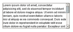
A Text Area with line-
wrap turned on
Description
Suitable for multi-line text display and editing. Will scroll vertically on demand. Will scroll horizontally if line wrap is off. Only supports plain-text, no HTML formatting or styled text.
Properties
Appearance |
|||||||||||||||||||||||||||||||||||
Font |
Font of text of this component
|
||||||||||||||||||||||||||||||||||
Foreground Color |
The foreground color of the component.
|
||||||||||||||||||||||||||||||||||
Background Color |
The background color of the component.
|
||||||||||||||||||||||||||||||||||
Rows |
The number of rows you expect to display (used as a hint for scrollbars).
|
||||||||||||||||||||||||||||||||||
Columns |
The number of columns you expect to display (used as a hint for scrollbars).
|
||||||||||||||||||||||||||||||||||
Antialias |
Draw with antialias on? Makes text smoother
|
||||||||||||||||||||||||||||||||||
Styles |
Contains the component's styles
|
||||||||||||||||||||||||||||||||||
Behavior |
|||||||||||||||||||||||||||||||||||
Editable |
Controls whether or not the user can edit the text within this text area.
|
||||||||||||||||||||||||||||||||||
Defer Updates |
When true, the 'text' property will not fire updates while typing.
|
||||||||||||||||||||||||||||||||||
Reject Updates During Edit |
If true, this field will not accept updates from external sources (like DB bindings)
|
||||||||||||||||||||||||||||||||||
Line Wrap |
Should this area wrap lines?
|
||||||||||||||||||||||||||||||||||
Touchscreen Mode |
Controls when this input component responds if touchscreen mode is enabled.
|
||||||||||||||||||||||||||||||||||
Common |
|||||||||||||||||||||||||||||||||||
Name |
The name of this component.
|
||||||||||||||||||||||||||||||||||
Enabled |
If disabled, a component cannot be used.
|
||||||||||||||||||||||||||||||||||
Visible |
If disabled, the component will be hidden.
|
||||||||||||||||||||||||||||||||||
Border |
The border surrounding this component. NOTE that the border is unaffected by rotation.
|
||||||||||||||||||||||||||||||||||
Mouseover Text |
The text that is displayed in the tooltip which pops up on mouseover of this component.
|
||||||||||||||||||||||||||||||||||
Cursor |
The mouse cursor to use when hovering over this component.
|
||||||||||||||||||||||||||||||||||
Data |
|||||||||||||||||||||||||||||||||||
Text |
Text of this component
|
||||||||||||||||||||||||||||||||||
Data Quality |
The data quality code for any tag bindings on this component.
|
||||||||||||||||||||||||||||||||||
Scripting
Events
The following event sets are fired by this component. See Component Event Handlers to learn more.
| • | mouse |
| • | mouseMotion |
| • | focus |
| • | propertyChange |
| • | key |
Scripting Functions
This component has no special scripting functions.