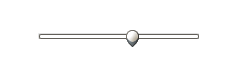
 A basic Slider |
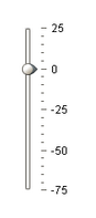 A vertical Slider |
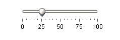 A Slider with tickmarks |
Description
The slider component lets the user drag an indicator along a scale to choose a value in a range. The Defer Updates property determines whether or not the slider's Value changes as the user drags the mouse, or whether it waits until the user drops the slider handle.
Properties
Appearance |
|||||||||||||||||||||||||||||||||||
Font |
Font of text of this component
|
||||||||||||||||||||||||||||||||||
Foreground Color |
The foreground color of the component.
|
||||||||||||||||||||||||||||||||||
Background Color |
The background color of the component.
|
||||||||||||||||||||||||||||||||||
Horizontal Slider |
If true, slider is horizontal. Otherwise, it's vertical
|
||||||||||||||||||||||||||||||||||
Major Tick Spacing |
The distance, measured in values, between each major tick mark
|
||||||||||||||||||||||||||||||||||
Minor Tick Spacing |
The distance, measured in values, between each minor tick mark
|
||||||||||||||||||||||||||||||||||
Paint Track? |
If true, the trac of the slider will be shown.
|
||||||||||||||||||||||||||||||||||
Paint Labels? |
If true, value labels will be shown.
|
||||||||||||||||||||||||||||||||||
Paint Ticks? |
If true, value tick marks will be shown.
|
||||||||||||||||||||||||||||||||||
Antialias |
Draw with antialias on? Makes text smoother
|
||||||||||||||||||||||||||||||||||
Styles |
Contains the component's styles
|
||||||||||||||||||||||||||||||||||
Behavior |
|||||||||||||||||||||||||||||||||||
Defer Updates |
Only publish updates to value when not actively being changed.
|
||||||||||||||||||||||||||||||||||
Snap To Ticks? |
|
||||||||||||||||||||||||||||||||||
Inverted? |
Specify true to reverse the value range shown for the slider and false to put the value range in the normal order.
|
||||||||||||||||||||||||||||||||||
Common |
|||||||||||||||||||||||||||||||||||
Name |
The name of this component.
|
||||||||||||||||||||||||||||||||||
Enabled |
If disabled, a component cannot be used.
|
||||||||||||||||||||||||||||||||||
Visible |
If disabled, the component will be hidden.
|
||||||||||||||||||||||||||||||||||
Border |
The border surrounding this component. NOTE that the border is unaffected by rotation.
|
||||||||||||||||||||||||||||||||||
Mouseover Text |
The text that is displayed in the tooltip which pops up on mouseover of this component.
|
||||||||||||||||||||||||||||||||||
Cursor |
The mouse cursor to use when hovering over this component.
|
||||||||||||||||||||||||||||||||||
Data |
|||||||||||||||||||||||||||||||||||
Value |
The current value of the slider.
|
||||||||||||||||||||||||||||||||||
Minimum Value |
The value when the slider is all the way left or down
|
||||||||||||||||||||||||||||||||||
Maximum Value |
The value when the slider is all the way right or up
|
||||||||||||||||||||||||||||||||||
Data Quality |
The data quality code for any tag bindings on this component.
|
||||||||||||||||||||||||||||||||||
Scripting
Events
The following event sets are fired by this component. See Component Event Handlers to learn more.
| • | mouse |
| • | mouseMotion |
| • | focus |
| • | propertyChange |
| • | key |
Scripting Functions
This component has no special scripting functions.