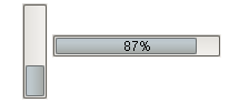
Description
Visually indicates the progress of some task. Can be used to display any value that has an upper and lower bound.
Properties
Appearance |
|||||||||||||||||||||||||||||||||||
Font |
Font of text of this component
|
||||||||||||||||||||||||||||||||||
Foreground Color |
The foreground color of the component.
|
||||||||||||||||||||||||||||||||||
Background Color |
The background color of the component.
|
||||||||||||||||||||||||||||||||||
Horizontal? |
If true, the progress bar will display horizontally, else it will display vertically
|
||||||||||||||||||||||||||||||||||
Show Percentage? |
If true, the progress bar will display its percentage.
|
||||||||||||||||||||||||||||||||||
Direction |
Determines the direction of progress for this progress bar.
|
||||||||||||||||||||||||||||||||||
Antialias |
Draw with antialias on? Makes text smoother
|
||||||||||||||||||||||||||||||||||
Styles |
Contains the component's styles
|
||||||||||||||||||||||||||||||||||
Behavior |
|||||||||||||||||||||||||||||||||||
Indeterminate? |
When true, the progressbar displays animation indicating that something is happening, but it will take an indeterminate amount of time
|
||||||||||||||||||||||||||||||||||
Common |
|||||||||||||||||||||||||||||||||||
Name |
The name of this component.
|
||||||||||||||||||||||||||||||||||
Enabled |
If disabled, a component cannot be used.
|
||||||||||||||||||||||||||||||||||
Visible |
If disabled, the component will be hidden.
|
||||||||||||||||||||||||||||||||||
Border |
The border surrounding this component. NOTE that the border is unaffected by rotation.
|
||||||||||||||||||||||||||||||||||
Mouseover Text |
The text that is displayed in the tooltip which pops up on mouseover of this component.
|
||||||||||||||||||||||||||||||||||
Cursor |
The mouse cursor to use when hovering over this component.
|
||||||||||||||||||||||||||||||||||
Data |
|||||||||||||||||||||||||||||||||||
Value |
The current state of the Progress Bar.
|
||||||||||||||||||||||||||||||||||
Maximum |
The maximum value that this progress bar will reach
|
||||||||||||||||||||||||||||||||||
Minimum |
The minimum value that this progress bar will reach
|
||||||||||||||||||||||||||||||||||
Data Quality |
The data quality code for any tag bindings on this component.
|
||||||||||||||||||||||||||||||||||
Scripting
Events
The following event sets are fired by this component. See Component Event Handlers to learn more.
| • | mouse |
| • | mouseMotion |
| • | propertyChange |
Scripting Functions
This component has no special scripting functions.