Description
The image component is a deceptively powerful component. While you can use other components, like the Label, to display images as well, this component gives you much more flexibility. In particular, this component has 4 important features for displaying images:
| 1. | Scaling. |
| 2. | Rotation. You can use rotation to create spinning animations by binding it to a Timer component. |
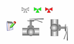
| 3. | Color Tinting. Dynamically apply a color tint to an image to allow it to display realtime status. |
| 4. | Color Swapping. Use color swapping to change one specific color in an image to another, on the fly. Also used for realtime status display. |
To choose an image, simply press the browse button (  ) next to this component's Image Path property. You can drag new images (*.png, *.gif, *.jpg, *.bmp) into the Image Management window to upload them.
 Images are stored on the Gateway, not in your window or project. This means that you can alter an image globally, and it will affect all windows in all projects. It also means that you must be careful to migrate custom images if you do project backups (as opposed to Gateway backups, which will automatically include both projects and images)
Properties
Appearance |
|||||||||||||||||||||||||||||||||||
Styles |
Contains the component's styles
|
||||||||||||||||||||||||||||||||||
Behavior |
|||||||||||||||||||||||||||||||||||
Use Cache |
If false, this image will bypass the client image cache and load the image directly from the source.
|
||||||||||||||||||||||||||||||||||
Load In Background |
Controls whether or not the image loading takes place on the UI thread or a background thread.
|
||||||||||||||||||||||||||||||||||
Common |
|||||||||||||||||||||||||||||||||||
Name |
The name of this component.
|
||||||||||||||||||||||||||||||||||
Enabled |
If disabled, a component cannot be used.
|
||||||||||||||||||||||||||||||||||
Visible |
If disabled, the component will be hidden.
|
||||||||||||||||||||||||||||||||||
Border |
The border surrounding this component. NOTE that the border is unaffected by rotation.
|
||||||||||||||||||||||||||||||||||
Mouseover Text |
The text that is displayed in the tooltip which pops up on mouseover of this component.
|
||||||||||||||||||||||||||||||||||
Cursor |
The mouse cursor to use when hovering over this component.
|
||||||||||||||||||||||||||||||||||
Data |
|||||||||||||||||||||||||||||||||||
Image Path |
The relative path of the image.
|
||||||||||||||||||||||||||||||||||
Disabled Image Path |
The relative path of the image to be displayed when this component is not enabled.
|
||||||||||||||||||||||||||||||||||
Data Quality |
The data quality code for any tag bindings on this component.
|
||||||||||||||||||||||||||||||||||
Image Manipulation |
|||||||||||||||||||||||||||||||||||
Stretch Mode |
Sets the stretch mode for this image.
|
||||||||||||||||||||||||||||||||||
Stretch Width |
If stretch mode is "Parameters", this will be the stretched width of the image
|
||||||||||||||||||||||||||||||||||
Stretch Height |
If stretch mode is "Parameters", this will be the stretched height of the image
|
||||||||||||||||||||||||||||||||||
Color Swap Filter |
Swap a specific color to another.
|
||||||||||||||||||||||||||||||||||
Swap From |
If the Color Swap Filter is on, this color will be changed to the Swap To color.
|
||||||||||||||||||||||||||||||||||
Swap To |
If the Color Swap Filter is on, the Swap From color will be changed to this color.
|
||||||||||||||||||||||||||||||||||
Swap Threshold |
Threshold (0-255) for the swap from color matching. 0 is no tolerance, 255 is max tolerance.
|
||||||||||||||||||||||||||||||||||
Tint Filter |
Tint the entire image a color (works best with greyscale images)
|
||||||||||||||||||||||||||||||||||
Tint Color |
If the Tint Filter is on, this is the color of the tint.
|
||||||||||||||||||||||||||||||||||
Flip Horizontal |
Flip (mirror) the image horizontally.
|
||||||||||||||||||||||||||||||||||
Flip Vertical |
Flip (mirror) the image vertically.
|
||||||||||||||||||||||||||||||||||
Rotation |
The angle of rotation in degrees.
|
||||||||||||||||||||||||||||||||||
Scripting
Events
The following event sets are fired by this component. See Component Event Handlers to learn more.
| • | mouse |
| • | mouseMotion |
| • | propertyChange |
Scripting Functions
This component has no special scripting functions.