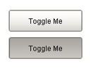
The two states of a
toggle button
Description
The toggle button represents a bit: on (selected) or off (not selected). Visually the button looks down or depressed when it is selected, and up when it is not selected. Logically, this component is very similar to the Check Box component. Note that for implementing a controls screen, the 2 State Toggle is usually more appropriate than this component.
Properties
Appearance |
|||||||||||||||||||||||||||||||||||
Font |
Font of text of this component
|
||||||||||||||||||||||||||||||||||
Foreground Color |
The foreground color of the component.
|
||||||||||||||||||||||||||||||||||
Background Color |
The background color for the button.
|
||||||||||||||||||||||||||||||||||
Background 3D? |
Should this button have a 3d type background, or a flat color one?
|
||||||||||||||||||||||||||||||||||
Opaque |
Set this to false if you want the button to be completely opaque.
|
||||||||||||||||||||||||||||||||||
Fill Area? |
Controls whether or not this button's internal area is filled
|
||||||||||||||||||||||||||||||||||
Border Painted? |
Should the border of this button be displayed?
|
||||||||||||||||||||||||||||||||||
Rollover? |
If true, the button may indicate that the mouse is hovering over it.
|
||||||||||||||||||||||||||||||||||
Label |
Text displayed on this button.
|
||||||||||||||||||||||||||||||||||
Image Path |
The relative path of the image.
|
||||||||||||||||||||||||||||||||||
Selected Image Path |
The relative path of the image to be displayed when this component is selected (toggled on).
|
||||||||||||||||||||||||||||||||||
Antialias |
Draw with antialias on? Makes text smoother
|
||||||||||||||||||||||||||||||||||
Styles |
Contains the component's styles
|
||||||||||||||||||||||||||||||||||
Behavior |
|||||||||||||||||||||||||||||||||||
Focusable |
If a button is not focusable, you will not be able to interact with it with the keyboard. This means you can't "tab" over to it.
|
||||||||||||||||||||||||||||||||||
Common |
|||||||||||||||||||||||||||||||||||
Name |
The name of this component.
|
||||||||||||||||||||||||||||||||||
Enabled |
If disabled, a component cannot be used.
|
||||||||||||||||||||||||||||||||||
Visible |
If disabled, the component will be hidden.
|
||||||||||||||||||||||||||||||||||
Border |
The border surrounding this component. NOTE that the border is unaffected by rotation.
|
||||||||||||||||||||||||||||||||||
Mouseover Text |
The text that is displayed in the tooltip which pops up on mouseover of this component.
|
||||||||||||||||||||||||||||||||||
Cursor |
The mouse cursor to use when hovering over this component.
|
||||||||||||||||||||||||||||||||||
Data |
|||||||||||||||||||||||||||||||||||
Selected |
State of this tToggle button.
|
||||||||||||||||||||||||||||||||||
Data Quality |
The data quality code for any tag bindings on this component.
|
||||||||||||||||||||||||||||||||||
Layout |
|||||||||||||||||||||||||||||||||||
Margin |
The space between a button's text and its borders.
|
||||||||||||||||||||||||||||||||||
Scripting
Events
The following event sets are fired by this component. See Component Event Handlers to learn more.
| • | mouse |
| • | item |
| • | mouseMotion |
| • | focus |
| • | action |
| • | propertyChange |
| • | key |
Scripting Functions
This component has no special scripting functions.