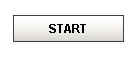
 Momentary Button |
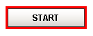 Activated Momentary Button |
Description
Momentary buttons are used to set a value for either a fixed amount of time, or however long the button remains held down, whichever is longer. Once the button is released, or the minimum time expires, the value is reset.
The momentary button uses its Control Value property to affect the underlying data. Typically, this property uses a bidirectional tag binding to an OPC tag. When pressed, it will write its On Value to Control Value. When released, it will either write Off Value to Control Value immediately, or wait until On Time has elapsed (since the pressed event).
The button's Indicator Value, which is typically bound to the same OPC tag as Control Value, is used to draw an "active" indication border around the button. This gives the operator positive feedback that the value has written successfully. It also lets an operator at one terminal know if an operator at a different terminal is using the button currently.
 Note that you may want to use the Latched Button instead of the Momentary Button if you simply need to send a signal to a PLC, and the PLC is able to reset the value. This lets the PLC reset the value, avoiding the potential for the bit to be left high. This is possible with the Momentary Button if, for example, the power to the client was cut while the button was held down.
Properties
Appearance |
|||||||||||||||||||||||||||||||||||
Font |
Font of text of this component
|
||||||||||||||||||||||||||||||||||
Foreground Color |
The foreground color of the component.
|
||||||||||||||||||||||||||||||||||
Background Color |
|
||||||||||||||||||||||||||||||||||
Background 3D? |
Should this button have a 3d type background, or a flat color one?
|
||||||||||||||||||||||||||||||||||
Fill Area? |
Controls whether or not this button's internal area is filled
|
||||||||||||||||||||||||||||||||||
Rollover? |
If true, the button may indicate that the mouse is hovering over it.
|
||||||||||||||||||||||||||||||||||
Text |
Text of this component
|
||||||||||||||||||||||||||||||||||
Indicator Width |
The width of the indication border that shows whether or not the indicator value is currently set.
|
||||||||||||||||||||||||||||||||||
On Color |
The color of the indicator border when the indicator value is on.
|
||||||||||||||||||||||||||||||||||
Off Color |
The color of the indicator border when the indicator value is off
|
||||||||||||||||||||||||||||||||||
Image Path |
The relative path of the image.
|
||||||||||||||||||||||||||||||||||
Disabled Image Path |
The relative path of the image to be displayed when this component is not enabled.
|
||||||||||||||||||||||||||||||||||
Icon-Text Spacing |
The space (in pixels) between the icon (if any) and the text (if any)
|
||||||||||||||||||||||||||||||||||
Antialias |
Draw with antialias on? Makes text smoother
|
||||||||||||||||||||||||||||||||||
Styles |
Contains the component's styles
|
||||||||||||||||||||||||||||||||||
Behavior |
|||||||||||||||||||||||||||||||||||
Mnemonic |
A single letter that will activate the button using 'ALT-mnemonic'.
|
||||||||||||||||||||||||||||||||||
On Value |
The value that will be written to the Control Value on mouse-down.
|
||||||||||||||||||||||||||||||||||
Off Value |
The value that will be written to the Control Value on mouse-up
|
||||||||||||||||||||||||||||||||||
Min Hold Time |
The minimum amount of time to keep the control value at the "On Value"
|
||||||||||||||||||||||||||||||||||
Max Hold Time |
The maximum amount of time to keep the control value at the "On Value"
|
||||||||||||||||||||||||||||||||||
Common |
|||||||||||||||||||||||||||||||||||
Name |
The name of this component.
|
||||||||||||||||||||||||||||||||||
Enabled |
If disabled, a component cannot be used.
|
||||||||||||||||||||||||||||||||||
Visible |
If disabled, the component will be hidden.
|
||||||||||||||||||||||||||||||||||
Mouseover Text |
The text that is displayed in the tooltip which pops up on mouseover of this component.
|
||||||||||||||||||||||||||||||||||
Border |
The border surrounding this component.
|
||||||||||||||||||||||||||||||||||
Cursor |
The mouse cursor to use when hovering over this component.
|
||||||||||||||||||||||||||||||||||
Data |
|||||||||||||||||||||||||||||||||||
Control Value |
Bind this to the tag that you want to control. (Typically, this is bound to the same location as Indicator Value)
|
||||||||||||||||||||||||||||||||||
Indicator Value |
Bind this to the tag that indicates the current state of the control value. (Typically, this is bound to the same location as Control Value)
|
||||||||||||||||||||||||||||||||||
Data Quality |
The data quality code for any tag bindings on this component.
|
||||||||||||||||||||||||||||||||||
Layout |
|||||||||||||||||||||||||||||||||||
Horizontal Alignment |
The horizontal alignment of the button's contents (text and/or image)
|
||||||||||||||||||||||||||||||||||
Horizontal Text Position |
The horizontal position of the button's text relative to its image
|
||||||||||||||||||||||||||||||||||
Vertical Alignment |
The vertical alignment of the button's contents (text and/or image)
|
||||||||||||||||||||||||||||||||||
Vertical Text Position |
The vertical position of the button's text relative to its image
|
||||||||||||||||||||||||||||||||||
Scripting
Events
The following event sets are fired by this component. See Component Event Handlers to learn more.
| • | mouse |
| • | mouseMotion |
| • | focus |
| • | action |
| • | propertyChange |
| • | key |
Scripting Functions
This component has no special scripting functions.