Tab strips are highly
customizable.
Description
In general, a tab strip is just a single-selection multiple choice component. In practice it is used anywhere that a user needs to be able to select between multiple windows or screens. It is most commonly used in a docked window to provide automatic window navigation. To support this typical use-case, the tab strip has two navigation modes:
| 1. | Swap to Window. (default) The tab strip will automatically call system.nav.swapTo() with the name of the selected tab. This facilitates very easy navigation for most common projects. |
| 2. | Disabled. The tab strip doesn't do anything when the tab selection changes. Users can implement their own via property bindings or by responding to the propertyChange scripting event. |
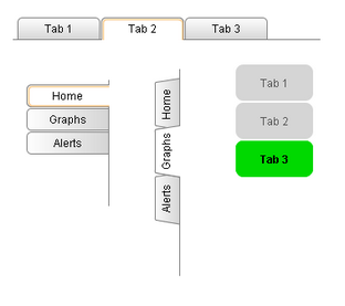
The tab strips visual style is highly customizable. There are different rendering styles, and things such as fonts, colors, line thicknesses, hover colors, and gradients are customizable within each rendering style. Use the Tab Strip's customizer to come up with a style that suits your project, as well as to manage the tabs that are present. The tabs and their styles are all stored in a dataset property (called Tab Data), so they can be modified at runtime as well.
See also:
Properties
Appearance |
|||||||||||||||||||||||||||||||||||
Background Color |
The background color of the component.
|
||||||||||||||||||||||||||||||||||
Orientation |
Orientation of the tab strip.
|
||||||||||||||||||||||||||||||||||
Selected Tab |
Name of the selected tab. This is also the name of the window that, if it exists, will be swapped to when this tab is pressed.
|
||||||||||||||||||||||||||||||||||
Renderer |
The renderer to use when rendering tabs.
|
||||||||||||||||||||||||||||||||||
Size Mode |
The sizing mode tabs use when deciding their size. Automatic means every tab is the same fixed size. Individual lets each tab decide its own size based on the size of its text.
|
||||||||||||||||||||||||||||||||||
Text Alignment |
The alignment of the tab text.
|
||||||||||||||||||||||||||||||||||
Text Offset |
Padding on the left or right of a tab's text, depending on alignment.
|
||||||||||||||||||||||||||||||||||
Text Padding |
Padding on each side of the text inside a tab.
|
||||||||||||||||||||||||||||||||||
Intertab Space |
The amount of space between each tab.
|
||||||||||||||||||||||||||||||||||
Rounding Radius |
Rounding radius for the tab corners.
|
||||||||||||||||||||||||||||||||||
Separator Thickness |
Thickness of the line drawn across the bottom and around each tab.
|
||||||||||||||||||||||||||||||||||
Separator Color |
Color of the line drawn across the bottom and around each tab.
|
||||||||||||||||||||||||||||||||||
Antialias |
Draw with antialias on? Makes text smoother
|
||||||||||||||||||||||||||||||||||
Styles |
Contains the component's styles
|
||||||||||||||||||||||||||||||||||
Behavior |
|||||||||||||||||||||||||||||||||||
Navigation Mode |
Navigation mode. Disabled does nothing when a tab is pressed. Swap to window swaps to the window whose name corresponds to the name of the selected tab, provided that window exists.
|
||||||||||||||||||||||||||||||||||
Common |
|||||||||||||||||||||||||||||||||||
Name |
The name of this component.
|
||||||||||||||||||||||||||||||||||
Enabled |
If disabled, a component cannot be used.
|
||||||||||||||||||||||||||||||||||
Visible |
If disabled, the component will be hidden.
|
||||||||||||||||||||||||||||||||||
Border |
The border surrounding this component. NOTE that the border is unaffected by rotation.
|
||||||||||||||||||||||||||||||||||
Cursor |
The mouse cursor to use when hovering over this component.
|
||||||||||||||||||||||||||||||||||
Data |
|||||||||||||||||||||||||||||||||||
Tab Data |
Tab Data.
|
||||||||||||||||||||||||||||||||||
Data Quality |
The data quality code for any tag bindings on this component.
|
||||||||||||||||||||||||||||||||||
Scripting
Events
The following event sets are fired by this component. See Component Event Handlers to learn more.
| • | mouse |
| • | mouseMotion |
| • | propertyChange |
Scripting Functions
This component has no special scripting functions.