Description
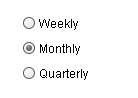
The radio button is similar to the CheckBox component, except for one special property. All radio buttons in the same Container (including the Root Container) will automatically be mutually exclusive. This means that only one radio button can be selected at a time. Radio buttons are a good way to let the user choose just one of a number of options. Dropdown Lists are another good way to do this.
Properties
Appearance |
|||||||||||||||||||||||||||||||||||
Font |
Font of text of this component
|
||||||||||||||||||||||||||||||||||
Foreground Color |
The foreground color of the component.
|
||||||||||||||||||||||||||||||||||
Background Color |
The background color of the component.
|
||||||||||||||||||||||||||||||||||
Fill Background |
If true, the label's background color will be drawn. If false, it will have a transparent background.
|
||||||||||||||||||||||||||||||||||
Text |
Text of this component
|
||||||||||||||||||||||||||||||||||
Margin |
The internal margin that provides padding for the contents of this button.
|
||||||||||||||||||||||||||||||||||
Antialias |
Draw with antialias on? Makes text smoother
|
||||||||||||||||||||||||||||||||||
Styles |
Contains the component's styles
|
||||||||||||||||||||||||||||||||||
Behavior |
|||||||||||||||||||||||||||||||||||
Rollover |
If true, the button may indicate that the mouse is hovering over it.
|
||||||||||||||||||||||||||||||||||
Focusable |
If a button is not focusable, you will not be able to interact with it with the keyboard. This means you can't "tab" over to it.
|
||||||||||||||||||||||||||||||||||
Common |
|||||||||||||||||||||||||||||||||||
Name |
The name of this component.
|
||||||||||||||||||||||||||||||||||
Enabled |
If disabled, a component cannot be used.
|
||||||||||||||||||||||||||||||||||
Visible |
If disabled, the component will be hidden.
|
||||||||||||||||||||||||||||||||||
Border |
The border surrounding this component. NOTE that the border is unaffected by rotation.
|
||||||||||||||||||||||||||||||||||
Mouseover Text |
The text that is displayed in the tooltip which pops up on mouseover of this component.
|
||||||||||||||||||||||||||||||||||
Cursor |
The mouse cursor to use when hovering over this component.
|
||||||||||||||||||||||||||||||||||
Data |
|||||||||||||||||||||||||||||||||||
Selected |
The current state of the RadioButton.
|
||||||||||||||||||||||||||||||||||
Data Quality |
The data quality code for any tag bindings on this component.
|
||||||||||||||||||||||||||||||||||
Layout |
|||||||||||||||||||||||||||||||||||
Horizontal Alignment |
The horizontal alignment of the button's contents (text and/or image)
|
||||||||||||||||||||||||||||||||||
Vertical Alignment |
The vertical alignment of the button's contents (text and/or image)
|
||||||||||||||||||||||||||||||||||
Scripting
Events
The following event sets are fired by this component. See Component Event Handlers to learn more.
| • | mouse |
| • | item |
| • | mouseMotion |
| • | focus |
| • | action |
| • | propertyChange |
| • | key |
Scripting Functions
This component has no special scripting functions.