 Column Selector
| Top | Previous | Next |
|
|
|
Icon in toolbar:
Description
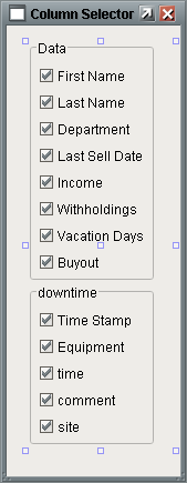
The Column Selector is a component that takes DataSets in, allows users to show or hide variables in the DataSets (Columns) via checkboxes, then outputs the resulting DataSet. The Column Selector allows users to choose which columns in a DataSet that they wish to use. If an object is bound to the Column Selector it will update itself whenever a user checks or unchecks a column. This allows users to dynamically show/hide: Table columns, "pens" on a graph, data in a Report Viewer, or any other component set up to use a DataSet. Properties
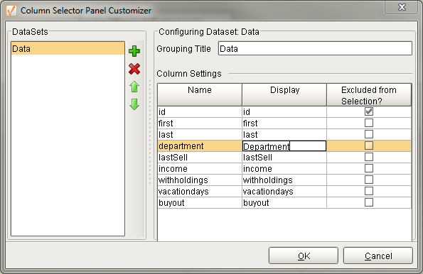
Customizer The Column Selector customizer is very straightforward. The left pane allows you to add and remove DataSets. Selecting a DataSet will display a list of columns in the table in the right pane. Under Display you may modify the name that users see. Excluded from Selection will remove the given column from the users list of choices. Events
Scripting Functions
| ||||||||||||||||||||||||||||||||||||||||||||||||||||||||||