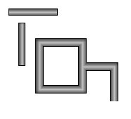
Pipe Segments, apart
and joined together
Description
The pipe segment component displays a quasi-3D pipe. In its basic form it looks very much like a rectangle with a round gradient. The difference comes in its advanced rendering of its edges and endcaps. You can configure each pipe segment's end to mate perfectly with another pipe segment butted up against it perpendicularly. The result looks like a pipe welded together in a 90° corner.
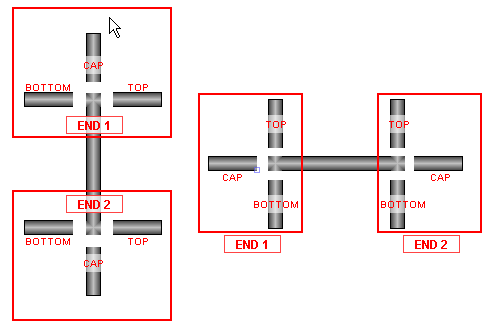
The control of the pipe's ends can be a bit confusing to a new user. It is done via 6 booleans - three per 'end'. End 1 is the top/left end, and End 2 is the bottom/right end. You turn off each boolean if there will be another pipe butted up against that side. The following diagram should make the naming conventions more clear:
Properties
Appearance |
|||||||||||||||||||||||||||||||||||
Center Fill |
The center of the fill gradient
|
||||||||||||||||||||||||||||||||||
Edge Fill |
The edge of the fill gradient.
|
||||||||||||||||||||||||||||||||||
Outline Color |
The color of the outline border
|
||||||||||||||||||||||||||||||||||
End 1 Top? |
Draw the border at end #1's top?
|
||||||||||||||||||||||||||||||||||
End 1 Cap? |
Draw the border at end #1's cap?
|
||||||||||||||||||||||||||||||||||
End 1 Bottom? |
Draw the border at end #1's bottom?
|
||||||||||||||||||||||||||||||||||
End 2 Top? |
Draw the border at end #2's top?
|
||||||||||||||||||||||||||||||||||
End 2 Cap? |
Draw the border at end #2's cap?
|
||||||||||||||||||||||||||||||||||
End 2 Bottom? |
Draw the border at end #2's bottom?
|
||||||||||||||||||||||||||||||||||
Styles |
Contains the component's styles
|
||||||||||||||||||||||||||||||||||
Common |
|||||||||||||||||||||||||||||||||||
Name |
The name of this component.
|
||||||||||||||||||||||||||||||||||
Visible |
If disabled, the component will be hidden.
|
||||||||||||||||||||||||||||||||||
Border |
The border surrounding this component. NOTE that the border is unaffected by rotation.
|
||||||||||||||||||||||||||||||||||
Mouseover Text |
The text that is displayed in the tooltip which pops up on mouseover of this component.
|
||||||||||||||||||||||||||||||||||
Cursor |
The mouse cursor to use when hovering over this component.
|
||||||||||||||||||||||||||||||||||
Data |
|||||||||||||||||||||||||||||||||||
Data Quality |
The data quality code for any tag bindings on this component.
|
||||||||||||||||||||||||||||||||||
Scripting
Events
The following event sets are fired by this component. See Component Event Handlers to learn more.
| • | mouse |
| • | mouseMotion |
| • | propertyChange |
Scripting Functions
This component has no special scripting functions.