A lot of components in Ignition accept HTML. Using HTML enables you to add a unique look to your project. As an example, many users wish to have text on buttons and labels wrap onto multiple lines. This is a formatting feature that at first glance appears to be absent from Ignition. This style option is actually easily achievable by simply appending an opening html tag <html> to your text. Below is a short list of some of the other ways you can take advantage of HTML within Ignition. This list is not exhaustive so feel free to experiment with other components to see if they accept HTML.
Label Component
The Label component is one of the components that accepts HTML, making it very versatile. A label can display text, images, or both. The text can be HTML formatted. Here are the steps to add HTML to a label:
| 1. | Open the Ignition Designer and drag the Label component from the Display tab of the Component Palette. |
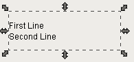
| 2. | The Label component has a Text property for what is displayed. By default the text is a single line. We can add HTML to make the label multi-line, bold certain text, underline certain text and more. Set the text property to the following: |
<HTML>First Line<BR>Second Line
The label now has two lines.
Button Component
The Button component also accepts HTML:
| 1. | Open the Ignition Designer and drag the Button component from the Buttons tab of the Component Palette. |
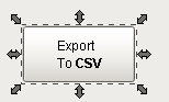
| 2. | The Button component also has a Text property for what is displayed. By default the text is a single line. Set the text property to the following: |
<HTML>Export<BR>To <B>CSV</B>
Mouseover Text
One of the most powerful places to use HTML is on the Mouseover Text property that exists on every component. The Mouseover Text is the text that is displayed in the tooltip, which pops up on mouseover of the component. You can display information about the component or the signal it is bound to.
| 1. | Open the Ignition Designer and drag a Label component from the Display tab of the Component Palette. |
| 2. | The Label component has a Mouseover property. By default the text is a single line. Set the Mouseover property to the following: |
<HTML>Instructions<BR><UL><LI>Step 1</LI><LI>Step 2</LI><LI>Step 3</LI></UL>
| 3. | Open the client (runtime) and hover your mouse over the component to see the tooltip. |
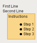 (*NOTE: Here the tooltip was added to the label from the first example)
Table Component
Another place you can add HTML is the Table component. You can add HTML to the header row or to each of the individual cells of the table. To add HTML to the header:
| 1. | Open the Ignition Designer and drag the Table component from the Tables tab of the Component Palette. |
| 2. | In the Property Editor, check the checkbox on the Test Data property to fill in some test data. |
| 3. | To change the table's header we need to use the Table Customizer. Right click on the table and select Customizers > Table Customizer. |
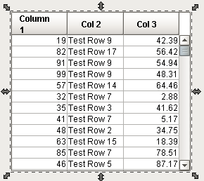
| 4. | In the header row you can add HTML to the display text in each column. Note: If you are using line breaks, you must put them in the first visible column header to set the height. Set the header value of the first column to the following: |
<HTML>Column<BR>1
Now the table's header has multiple lines.
.