Description
The circle component displays circle or an oval. The oval has a variable width outline and can optionally be filled with a color, or a circular gradient. In addition, you can enter a string which will be displayed in the center of the circle. To make the oval a perfect circle, remember to hold down Shift while creating/resizing a component to constrain proportions. (See Keyboard Shortcuts)
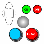
You can add dynamic properties to circles, so they make great status indicators. The "buttons" in the screenshot are made up of three circles overlapping.
Properties
${PROPERTIES}
Scripting
${EVENTS}
${SCRIPTING}