Description
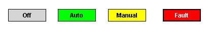
This component is a specialized label used to display a discrete state. The state must be represented by an integer, but the values and number of different states is customizable. Use the component's styles customizer to configure the different states.
See also:
Properties
Appearance |
|||||||||||||||||||||||||||||||||||
Font |
Font of text of this component
|
||||||||||||||||||||||||||||||||||
Foreground Color |
The foreground color of the component.
|
||||||||||||||||||||||||||||||||||
Background Color |
The background color of the component.
|
||||||||||||||||||||||||||||||||||
Image Path |
The relative path of the image.
|
||||||||||||||||||||||||||||||||||
Disabled Image Path |
The relative path of the image to be displayed when this component is not enabled.
|
||||||||||||||||||||||||||||||||||
Icon-Text Spacing |
The space (in pixels) between the icon (if any) and the text (if any)
|
||||||||||||||||||||||||||||||||||
Antialias |
Draw with antialias on? Makes text smoother
|
||||||||||||||||||||||||||||||||||
Styles |
Contains the component's styles
|
||||||||||||||||||||||||||||||||||
Common |
|||||||||||||||||||||||||||||||||||
Name |
The name of this component.
|
||||||||||||||||||||||||||||||||||
Enabled |
If disabled, a component cannot be used.
|
||||||||||||||||||||||||||||||||||
Visible |
If disabled, the component will be hidden.
|
||||||||||||||||||||||||||||||||||
Border |
The border surrounding this component. NOTE that the border is unaffected by rotation.
|
||||||||||||||||||||||||||||||||||
Mouseover Text |
The text that is displayed in the tooltip which pops up on mouseover of this component.
|
||||||||||||||||||||||||||||||||||
Cursor |
The mouse cursor to use when hovering over this component.
|
||||||||||||||||||||||||||||||||||
Data |
|||||||||||||||||||||||||||||||||||
State |
The current state of the component.
|
||||||||||||||||||||||||||||||||||
Text |
Text of this Label
|
||||||||||||||||||||||||||||||||||
Data Quality |
The data quality code for any tag bindings on this component.
|
||||||||||||||||||||||||||||||||||
Layout |
|||||||||||||||||||||||||||||||||||
Horizontal Alignment |
Determines the alignment of the label's contents along the X axis
|
||||||||||||||||||||||||||||||||||
Horizontal Text Position |
Determines the horizontal position of the label's text, relative to its image
|
||||||||||||||||||||||||||||||||||
Vertical Alignment |
Determines the alignment of the label's contents along the Y axis
|
||||||||||||||||||||||||||||||||||
Vertical Text Position |
Determines the vertical position of the label's text, relative to its image
|
||||||||||||||||||||||||||||||||||
Scripting
Events
The following event sets are fired by this component. See Component Event Handlers to learn more.
| • | mouse |
| • | mouseMotion |
| • | propertyChange |
Scripting Functions
This component has no special scripting functions.